Temperatures Will Keep Rising Until At Least 2040, But We Can Still Change What Comes After
It's not too late to act on climate change, but it's getting pretty urgent.
Here’s your daily grim climate fact: temperatures will likely keep smashing records until at least 2040, no matter what we do. And here’s the bright side: if we act now, we can still change what happens after that.
That finding comes from a new study published in Nature Climate Change today, which took a look at a couple of different projections of global temperatures over the next few years. The study found that while we’re likely to continue breaking temperature records for the next few decades, the actions to we take to combat climate change right now will have a huge impact on what comes afterwards.
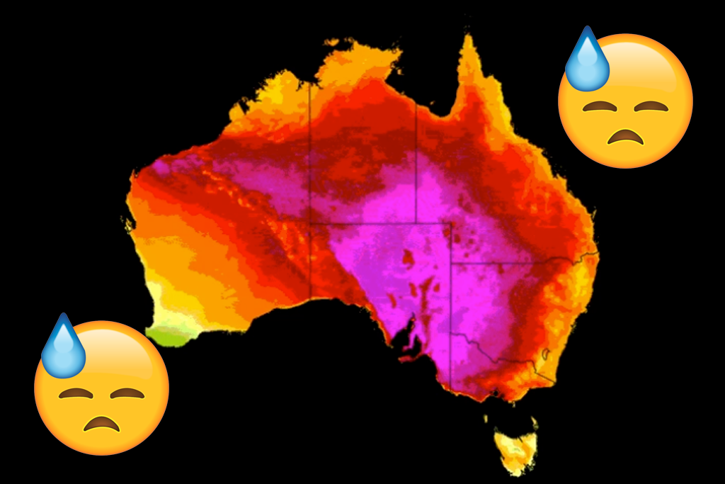
Here’s what that difference looks like. Under business-as-usual increases in greenhouse gas emissions — that is, if we take little to no action on climate change — by the end of the century, 58 percent of the world will be setting new records for average monthly temperatures every year. You know, like all those heatwave records we’ve been experiencing lately, except getting worse every single year.
By comparison, if we take action on climate change and start seriously cutting emissions — for example, by meeting our Paris Climate Agreement commitments — by the end of the century just 14 percent of the world will be setting new temperature records each year. The likelihood of smashing temperature records (i.e. breaking the record by a huge amount) also drops heaps if we get it together and start cutting emissions, falling from 8.9 percent to 1.1 percent.
There’s a pretty clear message here: it’s not too late to take action on climate change, but it really is getting quite urgent.
In fact, we can already see records are smashed year on year. If you want to get a simple look at what years of record-breaking temperatures look like, check out the website #ShowYourStripes, which condenses close to a century of annual average temperature data into a series of stripes ranging from blue (relatively colder) to red (relatively hotter).
Have a play with the diagram for different regions around the world, and you’ll quickly see a trend — the stripes for recent years are alarmingly red. In the past few years, many countries have consistently smashed temperature records year on year.
Climate scientist @ed_hawkins has created a fantastic #ClimateChange visualization tool derived from the global temperature record. Shown here are California temperatures over the past 100+ years. #ShowYourStripes by visiting: https://t.co/MhRnLKz769 #CAwx #climate #CAwater pic.twitter.com/lhIMGo4n1G
— Daniel Swain (@Weather_West) June 17, 2019
That kind of diagram is simple enough that even your climate denying local MP can understand it. Consider sending it to them, or even just shooting off a quick email or phone call asking the government to do something to cut emissions ASAP, pretty please, before the world ends.