South Australia’s New Logo Forgot Tasmania, Is Terrible
Check out some new state logos that we made out of clip art. We spent exactly $1.34 million less on them than South Australia did.

So South Australia launched its new logo overnight. It’s not very good, hey?
The logo was designed by advertising expert and obvious visual poet Ken Cato and was created to exist without a slogan, in fear that a slogan would date a graphic that already looks older than computers. At the launch, Premier Jay Weatherill called it a “bold statement about our place in Australia and our place in the world”. “Too often people are unaware of where South Australia is,” he said, a ridiculous claim considering the geographical clarity inherent in the title of the state itself. We’d be more worried about Tasmania, on account of, where is Tasmania? Poor Tasmania.

People have slammed the logo online, calling it “a folded milk carton”, a “Monopoly hotel”, “hideously disappointing” and “U paid how much 4 this appalling logo?Are we in 1995?”. We call it “clip art”.
Here is some clip art we made for the other states, which cost us quite a lot less than $1.34 million.
—
NSW: The Winner

Designer’s notes: “To us, this clip art represents the synergy of businessmen, nice hills, some wind and a broken monorail that NSW stands for. We like their pointy little heads.”
NSW: The Runner-Up

Designer’s notes: “This one was my favourite, but nobody knew whether New South Wales was actually the first state and our modem is down today.”
—
VICTORIA: The Winner

Designer’s notes: “We picked this one because it incorporates a small bar AND football, which are two things that Melbourne is into. As you can see, the football is “on the move”, so it ties really well with the Victorian slogan “on the move”. Also they look very happy and have tiny, tiny legs, which is very typical of Victorians.”
VICTORIA: The Runner-Up

Designer’s notes: “We vetoed this one in case it was racist.”
—
QUEENSLAND: The Winner

Designer’s Notes: “Hahaha the sun looks DRUNK.”
QUEENSLAND: The Runner-Up

Designer’s Notes: [no comment]
—
WESTERN AUSTRALIA: The Winner

Designer’s Notes: “The fat-cat here is a not-so-subtle reference to the mining fat-cats of Western Australia, including but not limited to Australian mining tycoon Gina Rinehart. I like the way the cat has a big tail and is wearing a suit.”
WESTERN AUSTRALIA: The Runner-Up

Designer’s Notes: “It’s almost TOO exciting.”
—
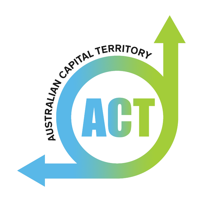
ACT: The Winner

Designer’s Notes: “This represents both Canberra’s lax firework laws AND Australia’s political system, as it marches cheerfully onwards towards its own demise.”
ACT: The Runner-Up
Designer’s Notes: “Roundabouts, yeah?”
—
TASMANIA: The Winner

Designer’s comments: “Who are these guys? What are they up to? Why are they so happy about it? These are the questions we find ourselves asking about Tasmania every day.”
TASMANIA: Runner-Up

—
Graphic mastery by Melanie Mahony.
