This Genius Interactive Map Traces Sydney’s Class Divides Through Fast Food
You've heard of the Red Rooster Line, now get ready for...
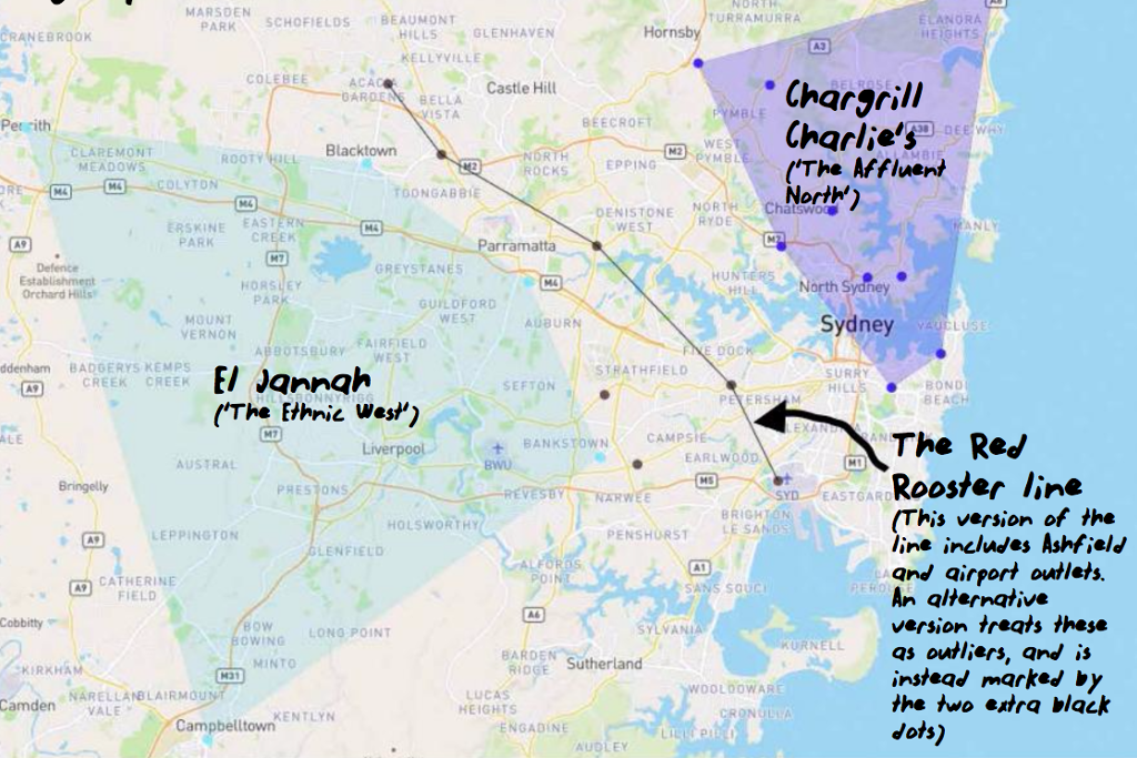
If you live in Sydney, you’ve almost certainly had a protracted pub argument about where exactly Western Sydney begins. In 2016, a visionary tweet proposed a solution to end that argument once and for all: draw a line between the locations of Sydney’s Red Rooster franchises, and a perfect boundary of Western Sydney emerges.
Always debate about the exact definition of Western Sydney: I present the Red Rooster Line (S. Hill an obv. outlier) pic.twitter.com/J1DsvpB02h
— Big Jez (@THE_REAL_BIGJEZ) February 7, 2016
At the time, the tweet was a revelation. Now, the editors of USyd’s student newspaper Honi Soit have gone a step further with an incredible interactive map of the distribution of food chains in Sydney. In an accompanying article, co-authors Ann Ding and Natassia Chrysanthos delve into what the groupings they’ve uncovered say about class, privilege and wealth in this city.
Which turns out to be quite a lot. The area bounded by El Jannah restaurants, for instance, provides an alternative potential definition of Western Sydney, and reveals that none fall east of the Red Rooster Line. The area covered by chicken joint Chargrill Charlie’s, meanwhile, overlaps pretty neatly with Sydney’s affluent North Shore. Doughnut Time marks out a “quadrilateral of relative financial comfort”; part of what the authors suggest be titled the Great Dessert Divide.
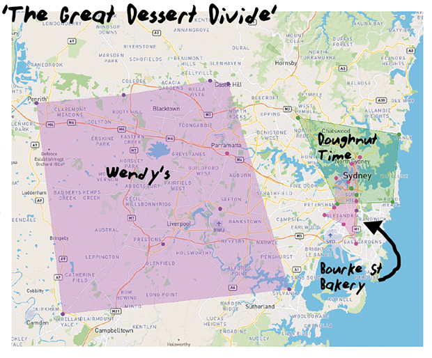
Sydney’s Great Dessert Divide, according to Honi Soit. Image via Honi Soit.
Ann Ding, one of the current editors of Honi Soit as well as one of the piece’s co-authors, said the whole thing was “a very out-of-the-blue idea” for them, born mostly from being, as she puts it, “a bunch of nerds who like data journalism”.
That, and the fact that “the Red Rooster line is fairly well known, and we just thought it couldn’t possibly be the only trend in that vein.”

Since the article was published earlier this week, it’s sparked discussion on Reddit and Twitter, and was tweeted out by the ABC this afternoon. Ann told Junkee the response has been “really cool!”
“A lot of different places have shown interest, and we’ve been tweeted by a few people. It’s cool how a lot of people identify with it, and interesting to think about how these things are such visible markers of class — and what this means for trying to level the inequalities of class.”
She also thanked The Australian for a similar piece that introduced them to the possibility of using Mapbox, an open source platform that allows you to make custom maps like the one in their article. This is, ah, not the first time Honi Soit has taken inspiration from the Oz, though both times the results have been pretty rad.
You can check out the interactive map and accompanying article here — we strongly recommend having a play around with it. And if you think you can improve it, the Honi Soit editors are happy to take your feedback and add to the map. They’re on twitter at @honi_soit.
_
Feature image via Honi Soit.