Meet The Girl Who Turns Airsick Bags Into Art
We chat to local typographer Gemma O'Brien about her odd (and incredibly impressive) hobby.
Created together with Qantas.
This piece is presented by #qantasblankcanvas — a movement that encourages people to get creative while flying, using the inflight bag in their seat pocket, and sharing it on social media.
–
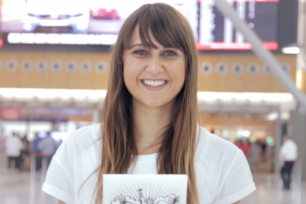
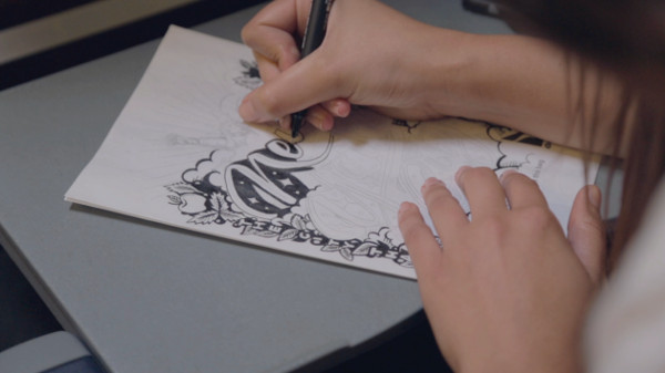
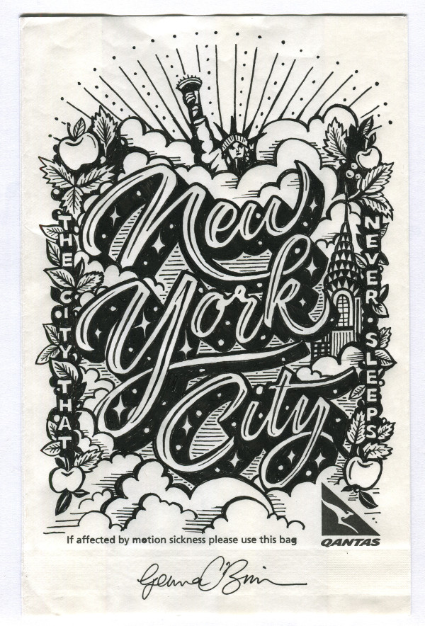
In the wise words of Yo Gabba Gabba and MGMT, “art is everywhere” — just ask Sydney-based typographer and illustrator Gemma O’Brien, whose latest venture involves creating art out of airline sick bags (yep, you heard us correctly). Looking for a way to pass the time while flying across the globe for work, Gemma started doodling on the bags for fun, but it later turned into what she calls the ‘Spew Bag Challenge’, a series of drawings that eventually became an exhibition. Qantas took a liking to the idea, and asked Gemma to collaborate with them in making the challenge viral.
We caught up with Gemma to hear about how she got into the not-so-well-known field of typography, and what motivated her to begin this project.
–
Junkee: How do you describe your occupation to strangers?
Gemma O’Brien: I’m a typographer and an artist. Basically, I specialise in any kind of illustration or work that involves words — often that might be logos, elements of advertising campaigns like commercial commissions, and also art-based practice where it’s a bit more conceptual but often uses the same techniques.
You’re mainly known for your obsession with typography. Is it a big field in Australia?
I think it’s definitely grown in the last five years or so. Typography as an element of graphic design has definitely become something that’s a lot more well-known outside the design world, but I guess Australia — compared to somewhere like America or Europe — doesn’t necessarily have a strong printing tradition, which sometimes informs the typography of that particular place. Australia has come into it fresh, drawing on inspiration from other places, and I think it’s just getting its own voice now.
Are there any other artists kicking around in the field that you admire or could recommend?
Yeah, definitely. In terms of illustrative typography, which is the domain where I mainly sit, there is Luke Lucas, Georgia Hill and Dave Foster, who does really beautiful design as well as illustrative work.
How did your interest in typography start?
I initially studied law when I finished high school and realised I needed to be doing something a bit more creative, so I dropped out and enrolled in a Communications and Design degree. It was when I was in the Letterpress Studio at the College of Fine Arts in Sydney that I got to experience typography the way it used to be set in newspapers. I liked the old-school techniques, where each of the letters were suitable pieces of metal — that really sparked an interest in typography and printing and that whole world. Then, it was something that was really self-driven: I would read books about type, I’d see it in the environment all around me, and it just kind of grew from a passion into a career.
You also work as an illustrator. Do your illustrations always end up containing type?
That’s often the way! I tend to think of typography as an illustration, so the words become a picture; if you’re working with a font, it’s like two separate elements. Every now and then I’ll do something that’s got no letters in it, but often they do merge in some kind of way — for me, illustration and type are interchangeable.
What’s an average day like for you? Do you have a routine?
I do, it’s quite a bizarre routine. I’m a bit of a night owl, so the majority of my creative work is done between 10pm and 4am when everyone else is asleep. I’ll stay up in my studio working on commercial projects and art stuff, and then during the day I’ll deal with e-mails, sometimes have meetings, conference calls about projects, and do a lot more of the admin side.
You kinda missed sleep in that description! Is there sleep?
Ah, I sleep between, like, 4am and 10am. By the time I wake up, all the art directors are back in their office checking their emails and giving feedback, so it works perfectly.
You’ve worked with some big brands including Woolworths, Vodaphone, The New York Times, and now Qantas. What are the golden rules of working with big brands?
I think it’s just important to understand the difference between using typography for a big brand or a commercial client, as opposed to a personal or art-based project. You’re working with a particular brand vision and it’s their voice trying to get a message out as opposed to your own, so it’s about knowing when to separate yourself from your work and finding the overlaps between your work and the client.

What about some rules from a business point-of-view? Are there any rules you put in place between you and the client to protect yourself?
People sometimes forget that there’s an intellectual property element — when a brand takes your artwork, you need to be rewarded for that process and the conceptual side of things that often can’t be jotted down in time-sheets. I think when you’re first starting out, it can be hard to understand all the ways of budgeting for the usage of artwork — it’s something I’ve only picked up since I’ve started working with bigger brands.
How does travel influence and inspire your work?
Travel is very influential to my work. New cities provide great inspiration for new approaches to styles and materials. The typographic landscape of a city can be so diverse and can represent the history and culture of a place. Traditions of writing that are unique to a particular place can also be the starting point for using new tools to create letterforms.
Tell us a bit about how your collaboration with Qantas came about.
Well, I’ve been creating artwork from the bags on planes while travelling for about a year. After I had an exhibition of all the artworks, I think they’d seen it on social media so they came along to see what it was all about. Since I was travelling so much with work for conferences and workshops, flying and travelling were always going to intersect with the work I was doing — they saw that, and got in touch to see if I’d be interested in doing a collaboration.
Is this part of any bigger recognised movement going on in the art community, where everyday people can create something and share it via social media?
I mean, it’s happening so often with pretty much anything — anyone can create something, start a hashtag, and create a community out of nothing. I guess the idea that I had — passing time when I was flying, and drawing on spew bags — is kind of a derivative of that. It’s kind of a lo-fi thing, it doesn’t matter what your skill level is, and it’s quite easy to do.
Everyone paints and draws as a child, but our inhibitions seem to get the better of most of us when we grow up. I love that this campaign gives people an excuse to just have fun with it. What advice would you give to people who want to tap into that creative outlet again?
Yeah, it’s hard — the longer you leave it without drawing or whatever your creative outlet might be, the harder it is to get back into it because you’re immediately put off by the limitations of your own skills. It’s important to just find a way that’s more enjoyable for yourself, seeing the gradual improvement, and, yeah, just having fun with it. And it doesn’t have to be perfect. I think the fact that you’re drawing on something throwaway like the bags in seats or a serviette kind of takes the pressure off it being something important. You know, if it doesn’t look the way you want it to, it doesn’t really matter!
Yeah, it reminded me that the last time I drew anything was at a pizza place where they had paper on the tables and crayons, and we had a great time. It was probably the only time I’ve drawn in years…
Yeah! And I guess it’s also, like, the connection of doing something with your hands that’s tempting. So often these days we’re just typing on our phones or computers, so using your hands in a different way that is still connected to the thought process — there’s just something nice about that that will never go away.
You mention that one of your career highlights was directing a new title sequence for Play School. What is it about working on things we loved as kids that makes it so special?
There are things that had an impact on you growing up that you forget about until later in life, and then you realise — especially in the creative industries — that you’re creating things that might be really meaningful to someone else in the future. I remember the title sequence on Play School from when I was little, so the idea that there are lots of little people these days who are watching it and might one day remember a particular little element like the clock or the flower is really exciting.
Is there any person, brand, or project that you’re dying to work with? A career bucket list of sorts?
I used to want to work with Jerry Seinfeld, but I don’t know what I’d do for him. I think I just wanna hang out with him.
Finally, what’s your favourite Word font?
I don’t even use MS Word, so I don’t even know what their basic fonts are! Um… Curlz MT?
I’ll frame it a little differently: when you create a document in Word or Pages, what font do you usually use?
Oh, I use Helvetica!
–