This Endlessly Fascinating Interactive Map Breaks Down The Entire United States By Race
It's made up of over 300 million dots; one for each person living in America.
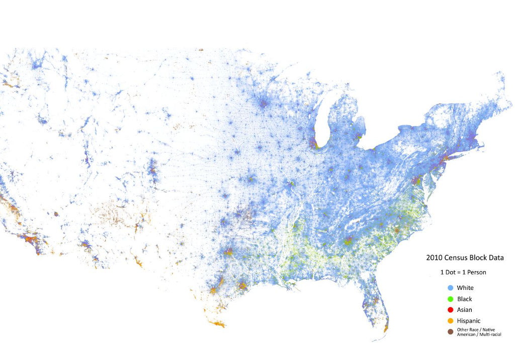
I won’t go into how great maps are or we’ll be here all day, but this map is something else. It’s made up of over 300 million coloured dots, each one representing where a person was at the time of the 2010 US Census, and has to be one of the most fascinating, painstakingly-constructed and informative maps ever made.
The brainchild of the Weldon Cooper Centre for Public Service at the University of Virginia, it’s been doing the rounds on Reddit thanks to PhatalFlaw, and gives a fascinating insight into how modern US cities are divided based on race and wealth. Besides from seeing where people in America live and don’t live as a whole, you can see with astonishing clarity how America’s cities have become, for all intents and purposes, racially segregated suburb by suburb, or even neighbourhood by neighbourhood.
Blue dots represent white people, green dots represent African-Americans, yellow/orange dots represent Hispanic people, and red dots represent Asian people, while blanks on the map can signify uninhabited areas like parks, airports, roads and public buildings with no-one living in them.
Take a look at Chicago:
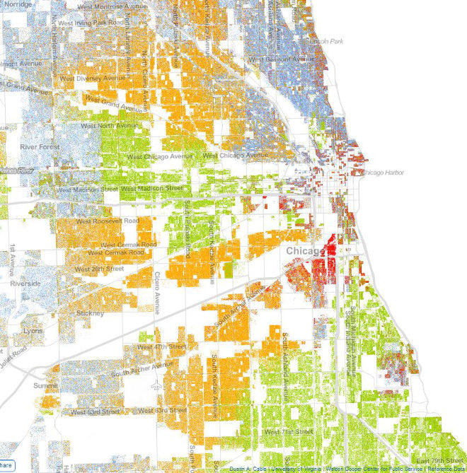
You can see that Asian people tend to coalesce in the inner city, Hispanics and blacks overwhelmingly inhabit the south and west sides, while white people are predominantly found in the north part of town and in the outer suburbs.
Here’s Baltimore in Maryland, another example of a city hugely geographically and racially divided:
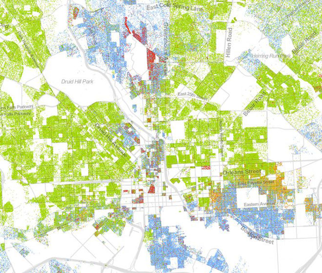
The empty part in the middle of the map signifies downtown, giving you a clue of how the city is structured. Again, you can see that there are overwhelmingly white suburbs, this time in the southeast and far north, while almost everywhere else has a largely black population.
Maybe the starkest example of how race defines where you live in major American cities is Detroit:
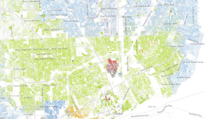
The map’s a little hard to interpret at this size, but you can see the black suburbs abruptly stop when they hit 8 Mile Road (of 8 Mile/Eminem fame) northern part of town, and the white suburbs begin straight after. Those blue suburbs on the right are more expensive to live in — and so are mostly inhabited by white people — because they’re near the water. Meanwhile, downtown Detroit has a sizeable Asian population that is present almost nowhere else in the city.
You could spend hours on this thing, drinking in what it has to reveal; how tiny fluorescent neighbourhoods stand out, how tightly packed-in people in New York and east coast cities live compared to the vast blank spaces in western states. Have a play around with it here. Go exploring.
–
All images via the Cooper Centre.